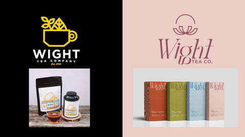
How It Started VS How It's Going: Branding Edition

My brother and I started Wight Tea Co in 2015. We had no experience and no idea what we were doing but we did have drive and passion. A friend’s boyfriend at the time was excited about what we were doing and offered to create our branding for free.
Our original final concept was flat, minimal, and geometric. Our colors were yellow, black and white. It felt trendy and exciting for a new small brand. Our fonts were Gotham and Thirsty Rough. We had no brand strategy or brand voice. Our target audience was simple - people looking for quality loose leaf tea. We had no research or data to go off. We also had no other brand guidelines - nothing to stick to.
As our business grew and its life continued we learned so much. After about a year I knew our look wasn’t the right fit for us. The tins were bulky, expensive, and always arriving damaged and had many other issues.
White, black, and yellow felt sterile and uninspiring. The logo and the design felt rigid. It grew to feel cheesy when I noticed that the font Thirsty had been adopted by the likes of Red Lobster and Cracker Barrel. I love CB's chicken and dumplings but we have way different audiences. Other issues we encountered included users being unsure of caffeine levels or type of teas in our blends. So I decided to try different things. It felt like every time we needed to reprint labels I was trying something different. Color changes, design changes...the branding got muddier and muddier.
I knew Wight Tea Co had (and has) amazing potential, but I was embarrassed of our branding. I had no confidence in pitching to anyone. It felt like rolling out of bed to go to a job interview wearing pajamas and having messy hair.
I sought out quotes from a few food-and-beverage specific brand designers and landed on Haylee Jordan. It felt a little like fate. She had an opening in her availability and everything just clicked.
With a better understanding of our target audiences, and our goals for our brand, we were able to build new branding around the foundation and framework that was our company. I love how our colors feel. We still have lots of negative space but it’s not cold and white, it’s exciting and warm. There is nothing sterile about us anymore. We use organic flowing patterns. Embossed on our boxes, it gives depth where we once felt two dimensional. We still have some items on our to-do list (web design, sample sets, social media templates, product photography) but we are in such a better position to create these things. I believe in progress over perfection.
A glance at our new logo and our new packaging may be exciting for anyone seeing us on a shelf or online or at a farmers market. But what they are really seeing and experiencing when they pick up one of our boxes and turn it over in their hands to look at it is 9 years of ups, downs, lessons learned, insight gained, partnerships, community, and my brother’s and my unending passion for creating good tea.